“Oh, Vienna” – Modern packaging design for traditional Christmas Cookies
- 6. Feb. 2025
- 4 Min. Lesezeit
Aktualisiert: 12. Nov. 2025
About the project – my intention and inspiration
I’ve always loved designing packaging that feels both elegant and playful. That passion led me to create “Oh, Vienna”—a collection of premium cookie tins celebrating classic Viennese Christmas cookies.
As an illustrator and designer, I wanted to combine my love for thoughtful packaging with my deep connection to the festive season and my hometown, Vienna. The result is four charming varieties: Vanillekipferl, Husarenkrapferl, Linzer Augen, and a Finest Christmas Cookie Selection. Each tin features a whimsical Viennese character or cultural icon, blending tradition with a fresh, contemporary twist.
The hand lettering Oh, Vienna logo, with its heart-shaped “V,” evokes warmth and coziness, while harmonious colors, gold accents, and sugar-grain snowflakes add a festive, luxurious feel.
Here’s a behind-the-scenes look at my creative process—how this idea turned into a cohesive and visually striking packaging concept through illustration, hand lettering, and thoughtful design choices.
The Approach
It all started with the idea to promote some graphics I created that will soon be available in my online store. It's a set of traditional Viennese Christmas cookies and baking tools—here are some examples:

So I dived deep into the subject of traditional Viennese baking, including the historical background. I soon came to the conclusion that the idea of traditional Vienna could best be conveyed through the image of some Viennese icons such as the classical music genius Wolfgang Amadeus Mozart, Empress Sissi and the Spanish Riding School.
I had a modern audience in mind that also has a sense of quality and culture, and likes to experience the traditional with a modern approach. It was therefore very important to me to bridge the gap between tradition and modernity. So I designed a playful, modern hand lettering logo and interpreted the icons in a lively, dynamic way, and gave the whole concept an elegant frame with the golden tins.
The illustration process
This short video gives you a little insight into my sketching process.
As you can see, at first I was just thinking of some kind of funny clown figure whose hat is the top of the famous St. Stephen's Church in Vienna. But during the sketching process, I decided on Mozart as the character to showcase the vanilla crescents, that I also worked into his hair (do you see it ;)?
And in case you're wondering why I also tried out to give him sunglasses: Do you remember the video of the 80s song “Amadeus” by Austrian music icon Falko? That's why.
Here you can see all the sketches of the characters and logo, some with color suggestions. I do my sketches in Procreate on the iPad.
For me, this app is perfect for sketching as it is very close to using a pencil naturally, and I love its powerful transformation features! I often need them to find the perfect shapes and compositions.


In this video you can see how I created the first vector version of the “Oh Vienna” Logo.
I love to work in Affinity Designer on the iPad. There will be a blog article about why soon, but you can already watch a video about it on my Instagram profile!
And here you can see how I refined the Logo:
Here are the finished designs: one advertising image each, the flat design and the design on the can, as well as a corporate pattern and examples in use.
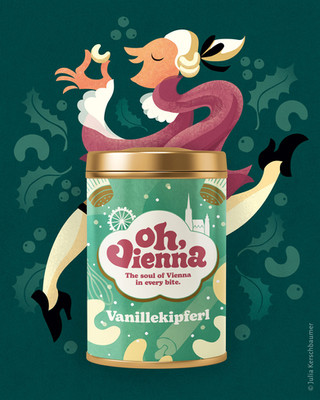
Vanillekipferl packaging design with happy Mozart
This series features a cheerful illustration of Mozart enjoying the iconic crescent-shaped cookies. The advertising visual, packaging design, and tin all reflect a playful yet sophisticated vibe that captures Vienna’s musical heritage.


Husarenkrapferl packaging with cookie enjoying empress Sissi
Empress Sissi (Elisabeth of Austria and Hungary) embellishes the advertisement of these jam-filled delights. The design balances imperial elegance with a lighthearted charm, showcasing Vienna’s royal history in a fresh and appealing way. Empress Sissi was not known for overeating, but she did like sweet little snacks. In the illustration, it was all too tempting to replace the famous diamond stars in her gorgeous hair with Husarenkrapferl!


Linzer Augen – packaging design with horsepower
The Linzer Augen cookies are represented by a Lipizzaner horse and a rider from the Spanish Riding School, symbolizing grace and tradition. This design adds a touch of grandeur to the playful packaging.


Finest Christmas Cookie Selection – A Festive Assortment
This tin combines various typical Viennese Christmas cookies in one luxurious package. It’s presented on a pattern of cookies alongside Vienna’s cultural icons.


Pattern Design for Corporate Identity
The illustrations of Mozart, Sissi, and the Lipizzaner have been transformed into a versatile pattern used for shopping bags, gift wrap, and other shop essentials. This cohesive branding extends the “Oh, Vienna” charm beyond the cookie tins, creating a memorable experience for customers.


“Oh, Vienna” celebrates the magic of Christmas, the beauty of Vienna, and the joy of blending tradition with modern design. I hope you enjoy this collection as much as I loved creating it!
If you would like to see such designs or illustrations on one of your product's packaging to excite your customers, just get in touch and let's talk about your project!
Kommentare