The secret of a good hand lettering illustration
- 2. Mai 2025
- 3 Min. Lesezeit

Between the initial idea and the first scribbles
I once had this idea for an illustration of my horse Roy, whose name could be well integrated into the body. The R as hind legs, the Y could be the forelegs somehow.

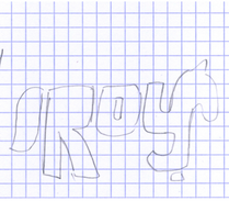


But when I scribbled it on the next piece of paper, it didn’t look cool at all. It was very stiff and just the opposite of a lively horse.

What did I do wrong?
I focused too much on the typography!
For a hand lettering illustration, you always have to sketch the illustrative part first. Then you can see how to integrate the letters.


Much better.
Once you have a lively sketch and start integrating the letters, the real challenge begins: legibility vs. recognizability. When is it a letter, and when is it a leg? The goal is to achieve both.

In this case, I had to change the position of the hind legs to make it work as an R. The Y was still too confusing.

So I closed some of the gaps — now the legs looked more like letters, but still worked as legs. Sometimes a small detail makes all the difference!

But the biggest improvement came from coloring one front leg differently. Now the name Roy and the legs stood out equally.
I created this illustration many years ago, when I had just gotten my horse. At that time, I created a typographic background describing the area he lived in —Viennese woods, lake, meadow, and so on. It looked nice, but 13 years later — and many experiences richer, both as an illustrator and a horsewoman —I felt the need to update the piece. Especially now, on Roy’s 20th birthday.

Updating the hand lettering illustration with more depth, more meaning
This time, I created a background full of words that reflect our close but sometimes complicated relationship. The letters also illustrate his surroundings: woods, fields, a river, and a meadow.


Again, I struggled with the typography. This time, I did a loose pre-drawing of the landscape — so far so good. Then I filled it with letters. But again, I focused too much on making them beautiful, font-like shapes. That didn’t work for an illustrated landscape.
Letting go of “Typography-Thinking”
Only when I let go of the “typography-thinking” and started focusing on filling the landscape shapes with letters, in a way they filled out all the space, did it begin to work.


I’ve always loved this retro, interconnected lettering style — and nothing else seemed to fit. In this way, the letters acted like puzzle pieces, building a surface. And just like that, a landscape was formed.

There are a few things to keep in mind when working on a hand lettering illustration like this:
The spaces between and inside the letters should be optically balanced.
The shapes of the letters should fill out the illustrated shapes, but still remain close to their standard forms — so they’re still readable.
Consistency is key! With so many letters, using only one lettering style helps avoid a confusing mess.
At first, I played with multiple styles. But the more letters you include, the more important it becomes to stick with one.
Blending text and image
Another important step was blending the background lettering with the rest of the illustration. I multiplied the layer and lowered the opacity slightly. This made the background feel more like an even surface rather than a collection of individual letters.
In conclusion
A good hand lettering illustration balances message and form, allowing typography and imagery to blend seamlessly into something both readable and visually expressive.
Kommentare