How one wine magazine illustration commission turned into two!
- 23. Sept. 2025
- 2 Min. Lesezeit
Aktualisiert: 23. Sept. 2025
Some time ago, I received a wonderful request—an editorial illustration for the British wine magazine Glug. It was for an article entitled “A taste of home” and told the story of how it is traditional in Georgia to grow grapevines in the garden and produce wine, and how this results in so many unique wine varieties.
I developed four concepts and presented them as sketches:
Four wine magazine illustration concepts:
Sketch 1 A/B


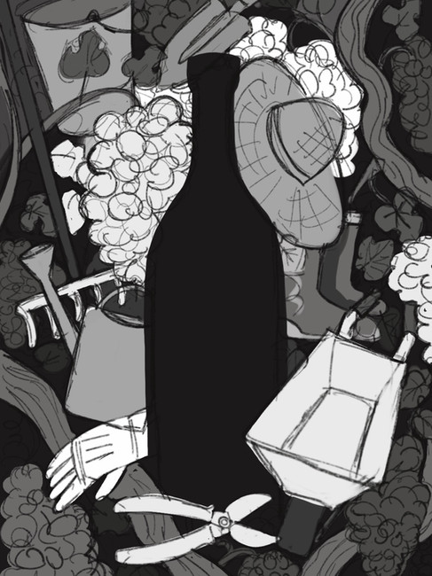
Sketch 1A:
That is a composition of grapes/vines/leaves with items of a domestic garden. They surround a bottle of wine and the label could give a hint on the home production.
Sketch 1B:
In this variation of Sketch1, I left the bottle as an empty space – so the Art Director could use it to place some text inside, like a quote from the article.
Sketch 2:

This “still life”, which combines a traditional Georgian clay jug with a watering can, is an approach to breaking down the theme in the simplest way possible, to grasp it at a glance.
Sketch 3:

This is a more surreal/fantastic approach, that shows the deep relationship between gardeners and their plants, the love and caring they invest every day in their home gardens and vines, which might be the secret why those wines have such a fine and special taste.
Sketch 4:

A glimpse through a hedge of vines shows a gardener tending to her vines in her home garden. The „peephole“ has the shape of a bottle, because it is meant to convey the idea of that tiny secret world of a domestic garden, which is the „main ingredient“ of these wines.
And the winner is …
The art director was very happy with all the variations, and was particularly positively surprised by Sketch 3 because it was a different approach to what they had previously featured in the magazine. So they decided on the imaginative approach (Sketch 3), which was also my favorite.
This is how it turned out:

What happened next?
After I had finished it—and everyone was very happy with the result—another request came in. The article was longer than expected, and they could use a small illustration at the end. The question was whether an element could be taken from the existing illustration to use as a spot illustration.
That wasn't really possible, so I offered to develop Sketch 2 as a spot illustration. That was a good solution for the art director, and so one job turned into two!


I always take the time to find the best solution for a commission. That's why I always come up with at least three concepts to choose from. Cases like this, where the extra work was rewarded with another sketch being commissioned for execution, are of course particularly nice!
This remains one of my favorite pieces of work to date. Thanks to art director Emlyn Firth from „a visual agency“ for making this happen!


Kommentare